
WeddingMakers
WeddingMakers is a B2B mobile app designed to support event planners in planing the event schedule and managing the vendors & other stakeholders. The concept of this app came after observing the inefficiencies in the life of event managers. Currently the process is majorly manual and highly operational. There is a clear need of improving their productivity, helping them to save time and be professional in managing their business.
"WeddingMakers is all in one event management platform for event managers"
Role: UX designer
Conducting interviews, making paper and digital wireframing, low and high-fidelity prototyping, conducting usability studies, accounting for accessibility, and iterating on designs.
Project Duration: July-August 2022
Link to Figma prototype:
User Research
To start understanding the user needs, interviews with event managers (especially wedding planners) were conducted. The questions varied from number of events to manager, vendor connections to the tools/platforms they currently use.
Research Questions
How many events does event manager plan at a time?
Before confirming a booking, what informations are exchanged between stakeholders?
Who are the stakeholders in any event?
Once a booking is confirmed, what are the next steps?
What is frequency of interaction with each stakeholder?
What are dependencies on clients and vendors?
What is the timeline of each step, after booking?
Are there any current tools/apps, etc. being used for the process?
If any tool/app is being used, the limitations of the same?
What are the difficulties in the current process?
User Pain Points
Managing multiple events
Planning & managing multiple events, creates numerous tasks on a daily basis. Tracking to-dos & their progress becomes a nightmare
No structured project management
There are different stages within a single event, involving numerous stakeholders. Lacking structured approach creates chaos
Managing too many vendors
Different vendors for different tasks are required and thus keeping a track of everyone`s progress is very difficult.
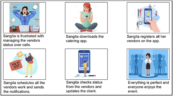
A User Example...
Sangita is an event planner who needs an app for management of teams/vendors and event planning because manual tracking of all the tasks is complicated and she forgets certain follow-ups.
User Persona

User Journey Map

User Storyboard
Competitive Audit
To identify what type of problems users face with competitors’ products, as well as understand what the users might expect from my product, potential competitors were chosen for conducting an competitive audit.
WedMeGood
CaterNinja
Strengths
-
Very good visual appeal
-
Caters the need of customers in all price ranges
Weakness
-
Just for users to find vendors, doesn’t have a feature to book on the app and track the status.
-
No language options.
Opportunities
-
Event planning options within app
-
Customization for business owners, expanding to B2B segment
Threats
-
More apps with additional features
Weakness
-
No language options.
-
Does not give an option to select the restaurant from where the food is expected.
Opportunities
-
Restaurant selection option will ensure customer satisfaction
Threats
-
Apps with more focus on UX and easier
-
Services providing incentives to users on reordering/bulk orders
Strengths
-
Customization options
-
Offers setup and service as well along with the food
-
Brining pre-cooked food reduces the mess at the venue
Starting the Design


Digital Wireframes
As the initial design phase continued, it was made sure to base screen designs on feedback and findings from the user research.


Paper Wireframes
Taking the time to draft iterations of each screen of the app on paper ensured that the elements that made it to digital wireframes would be well-suited to address user pain points.For the home screen, followings were prioritized: 1) adding a new event to plan and 2) accessing upcoming events.
To ideate the flow of the app, first paper wireframe designs of the main screens were drafted, that would be required in the app.
Usability Study
Goal
-
Determine if users can complete core tasks within the prototype of the event management app.
-
Determine if the app is difficult to use.
Objective
-
Determine the time it takes for a user to find and book a vendor in the app.
-
Observe how user navigate and plan the event.
-
Determine if the flow is smooth and user can navigate without getting stuck.
-
Determine more features users need in the app.
-
Determine if the app is easy to understand and use.
Methodology
-
Unmoderated usability study
-
Participants: 7 participants, includes event managers who have multiple events planning going on at a time, and individual vendors to see if the app is useful to them to collaborate with different vendors
-
Location: India, remote (each participant will complete the study in their own home)
-
Date: Sessions will take place on June 30 and July 1
-
Length: Each session will last 15 to 20 minutes, based on a list of prompts
-
Compensation: 500 Rupees amazon gift card
Results: Findings & Insights
After collecting the information, I created an Affinity Map which helped me to get a better overview and identify valuable insights.

Based on the affinity maps, the insights can be summarized as:
-
Users want to add multiple events.
-
Users wanted customization options for themes and events.
-
The plan new event option was not clear.
-
Vendor selection was confusing.
-
Reaching back to home screen was complicated.
Refine the Design
Mockups
Early designs allowed for planning new event, but after usability studies, I updated it to two sections, Add New Event and My Events, which allowed for customizations in the events as a continuous process.
Before Usability Study

After Usability Study

Before Usability Study

After Usability Study

Final Mockups
High Fidelity Prototype
The final high-fidelity prototype presented cleaner user flows for planning and managing an event.
The link to high-fidelity prototype:


Takeaways
Impact:
The app makes users feel like their needs are taken care-off.
One quote from peer feedback:
“The app designs made it so easy to plan my events! I would definitely use this app for managing all my events.”
What I learned:
While designing WeddingMakers, I learned that the first ideas for the app are only the beginning of the process. Usability studies and peer feedback influenced each iteration of the app’s designs.
Next Steps
1
Conduct another round of usability studies to validate whether the pain points users experienced have been effectively addressed.
2
Conduct more user research to determine any new areas of need.